


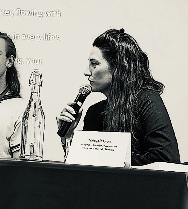
natasja


pelgrom
A Pioneer in Holistic Transformation

AS SEEN ON:


Initiating a Global Movement Toward Revolutionary Leadership Through Integrative Entheogenic and Stewardship Programs for Lasting Behavioural Change and Human Flourishing.


“Natasja is a very humble person, her mentoring has given me the tools to reconnect with myself and to develop myself while moving forward from my life blocks. Having a life-coach as Natasja is something that I really recommend to all people that are looking for their own inner peace. I really feel that without all the work we did together I could have never made a surgery I had. Thank you.”
— Mentee // Patrizia P. Engineer Italy

Work With Natasja
Strategic Advisory, Transformational Education & Immersive Retreats

One-on-One Mentorship
Private mentorship for leaders, facilitators, and practitioners navigating depth and meaningful transformation.
These tailored sessions offer strategic guidance, energetic attunement, and grounded insight supporting you to lead with clarity, metaphysical literacy, and embodied authority. Whether you are building a conscious business, stepping into greater visibility, or integrating a profound personal shift, this space is designed to strengthen your sovereignty, refine your discernment, and expand your capacity to make aligned decisions.
This is a confidential, high-trust container where complexity is welcomed and your evolution is taken seriously.

PROFESsIONAL SUPERVISiON
Advanced supervision for space holders, facilitators, and practitioners working in entheogenic, therapeutic, or transformational contexts.
This container provides ethical reflection, case consultation, and leadership development within complex relational dynamics. Rooted in Presence-Centered Leadership™, supervision supports discernment, boundary clarity, and professional maturity—ensuring your work remains aligned, responsible, and regenerative.

VIRTUAL EDUCATION
Natasja Pelgrom founded the Eudaimonia Institute as a global learning platform dedicated to embodied leadership and human flourishing.
Through curated courses, live classes, conferences, and integrative programs, participants develop the psychological, relational, and transpersonal competencies required for conscious leadership and ethical facilitation. Education here is both rigorous and experiential, bridging ancient wisdom with contemporary frameworks.

IN-PERSON IMMERSIVE
Awaken the Medicine Within was founded in 2017 as one of Europe’s premier legal, holistic entheogenic immersion experiences for deep transformation. It offers carefully curated, in-person retreats designed to support embodied awakening and lasting change.
These immersive journeys integrate entheogenic work, somatic practice, leadership development, earth-based wisdom, and community reflection within a safe and ethically grounded container. The intention is not peak experience, but sustainable behavioral transformation—anchored in maturity, purpose, and right relationship.
“It would be hard to overstate the profound experience provided by Natasja. The medicine is itself profound, but the true wonder of the experience comes from the skilful and meaningful construction of the retreat around it. Each ceremony and ritual complements and strengthens the next in a completely tangible and experiential way. The result is an individual experience within a shared group experience that is focussed with precision to achieve what is needed by that person at that time, supported by others. All this is powered with the authenticity, knowledge, and compassion of Natasja”
Retreat participant // ed P. therapist U.K.
Cultivating Leadership WITH Psychedelics
Watch Short Film
Special Thanks to Excitensia Film, Safe Journey, and 8 Marvilla Lisbon, Portugal